
Sophora
Sophora is a new health center in Siberia. The distinctive feature of the center is that it is meant for the whole family – doctors of different fields appoint both adults and children.
Challenge
Design the corporate identity, including all necessary media: health center walls, doors, door plates, external elevation, business cards.
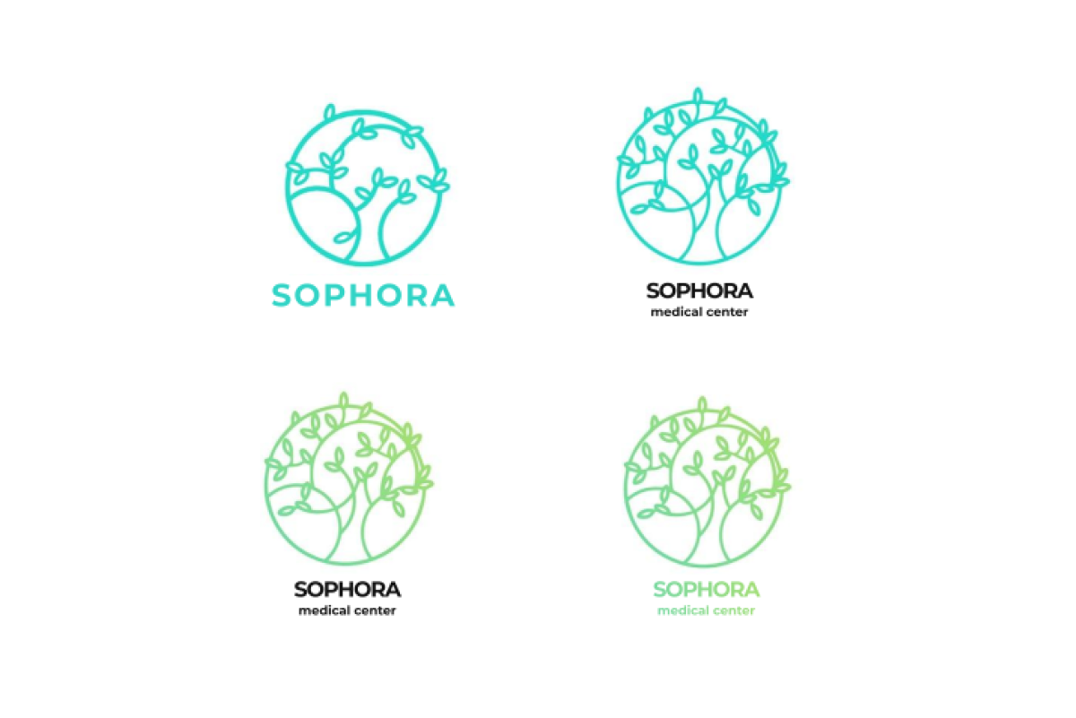
Logo designing
Sophora is a tree, the fruit of which is a remedy for many diseases and has a unique composition and coverage. It creates a soothing and anti-inflammatory effect. With certain substances, it treats conditions such as rheumatism, hemorrhages, avitaminosis. These and other qualities set the stage in making the brand, in particular, the company’s logo.
Pattern design
When designing a pattern, one needs to consider that it should be the same style as the logo and be an auxiliary to corporate identity development. We suggested several pattern options – light, neat, non-bulky, that could be used both in the carrier’s design and inside the health center.
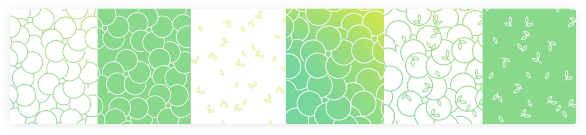
None of the first suggested options suited the pattern, but based on one of them it was decided to develop the idea with the sophora petals. This provided the basis for the agreed pattern.

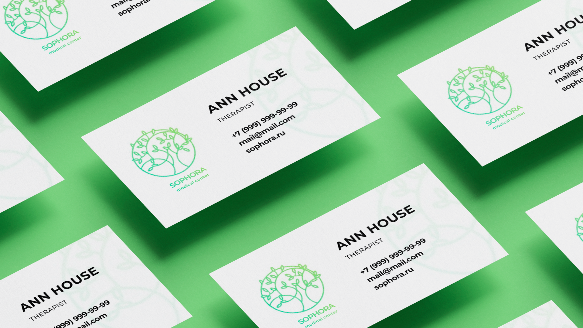
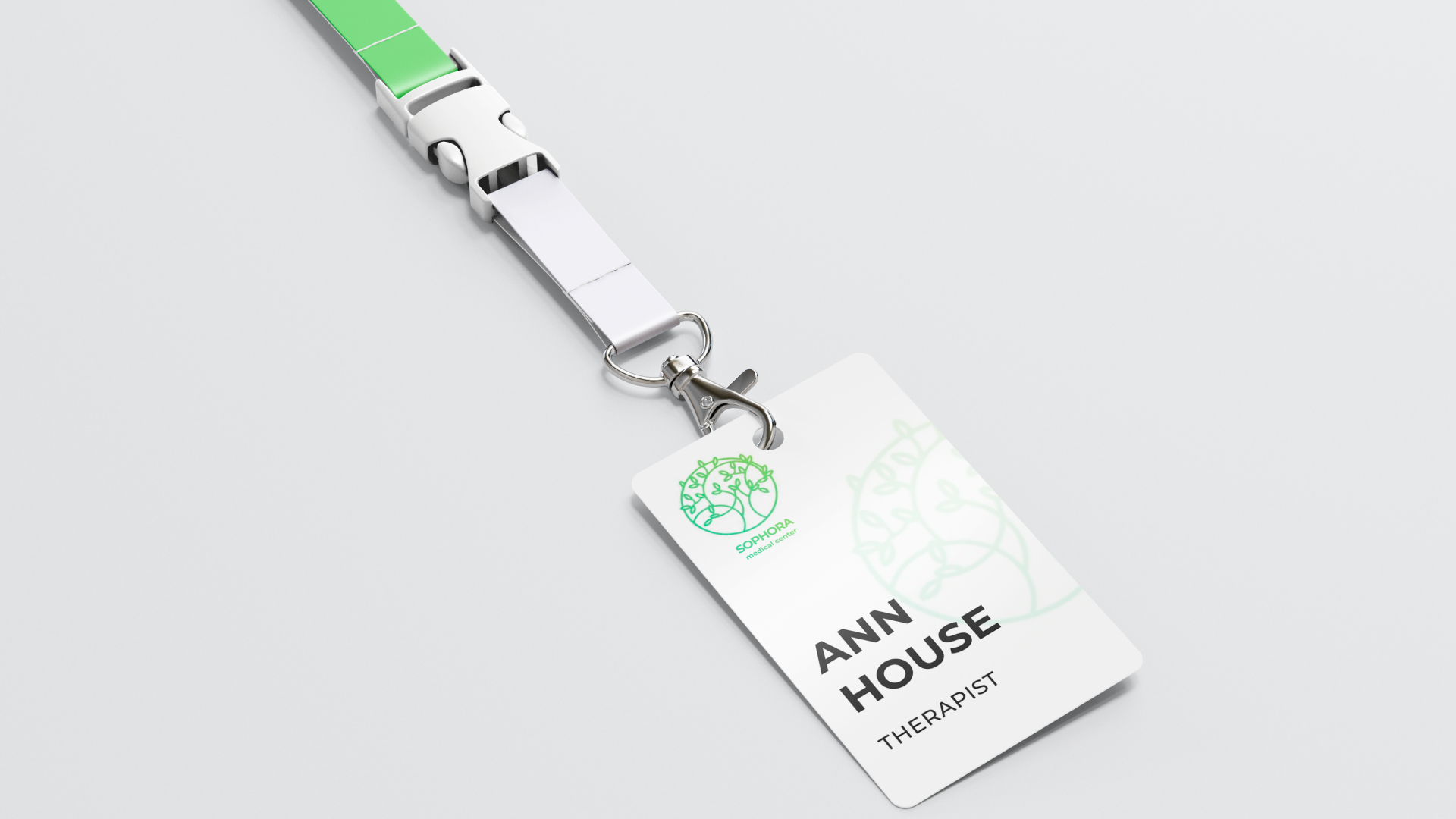
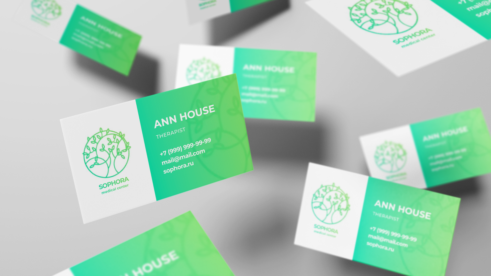
Carriers design
All the necessary media designed for Sophora: business cards, badges for the center staff, notepads, pens, balloons for the opening of the health center, and even documents (papers). For each of the media, several design options were suggested, particularly choosing the only suitable option out of the many agreed with the customer.
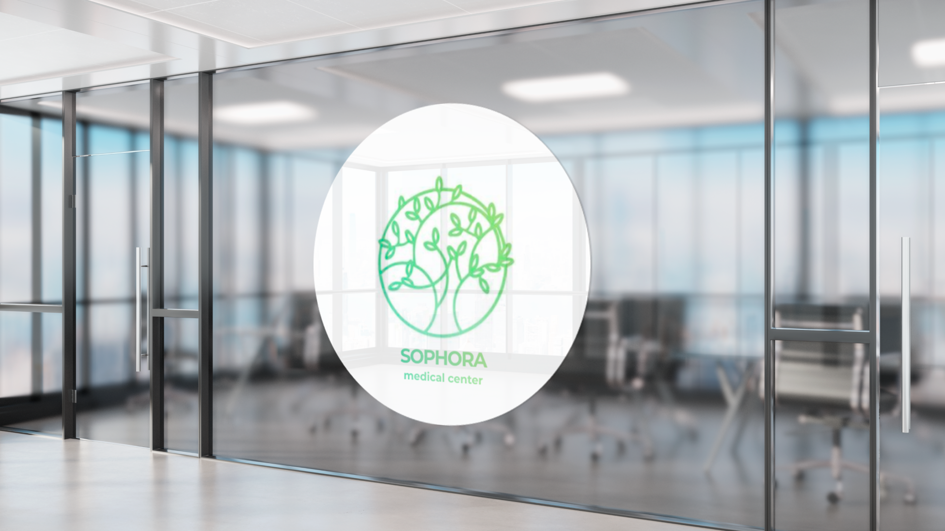
External elevation design
To raise the profile and memorability, we needed to design the external elevation of the building. The health center opened in a newly constructed building, so our team had a lot of room for creativity.
We took all the necessary photos of the building for this challenge, developed the layouts, measured the signs, prepared and submitted approved layouts for production. Installation of all parts was carried out under the supervision of our team to exclude any variances from the layouts.
Interior design
After the external elevation design was approved, we began designing the interior of the health center. We had to create the reception, door plates. Navigation signs, as well as offices and walls.
The architect and interior designer initially suggested using a backlight in the reception area, so the logo and lettering were made of a monochrome matte material without additional illumination.
When designing the signs and navigation, first, we considered the materials used to make the doors. This was the basis for selecting appropriate signs. However, staff had to change the signs several times a day due to the personnel schedule. Keeping in mind all the requirements, our designer suggested a large number of suitable solutions.