Easy school
Easy school is a network of educational centers. So far it has developed from a simple English school into an actual educational system: there are a huge amount of study courses in Easy School among which you can find something you’d love.
Task
- To develop a website about an educational center with a large number of study courses “Easy school”.
- Focus on a website franchise of educational centers in Kiev, Ulan-Ude and Krasnoyarsk.
- To make a simple and clear website structure and menu items hierarchy for users not to get lost in such amounts of information
Idea
Development of a full-fledged corporate website simply and clearly structured. It should become a face of the company and interest potential users. For this purpose we came up with unusual effects and made an animation.

Implementation
At the very beginning of work we faced a difficult challenge: customers from Easy School wanted the website to look impressive and interesting and at the same time to show that there is not only an English language training in their educational center but also a lot of other directions for growth.
We’ve developed a special first screen: right away a webpage user sees a “table” with pictures — different Easy School’s courses and training.
A big amount of courses and general information about the school, the need to impose legal data and ambitious customer’s plans — those things made developing the website’s structure much harder.
We wanted to sort out menu items and webpages, to structure all the information, to make navigation smooth and simple and not to shorten the texts about school’s work.
Therefore we’ve created a three-step menu: a user picks the field of education that interested him, then the course, and a certain section at the end
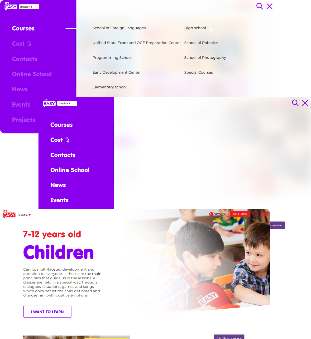
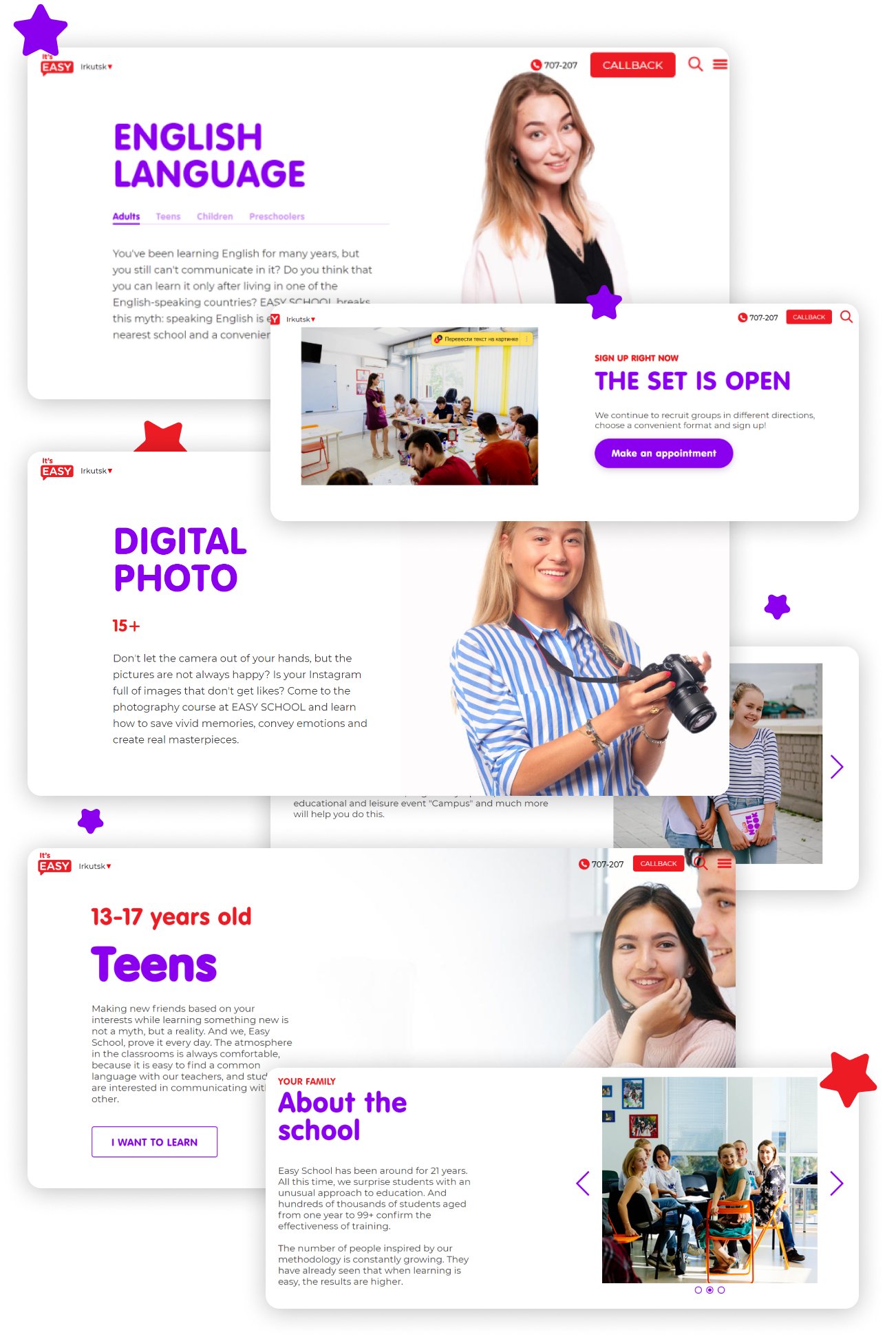
Moreover, we’ve decided to create a new interesting way to present information about courses and prices. Each web page looks like a landing with a space for stimulating customers to read the information.
From that webpage a customer finds out not only learning details but also a price, attendance time, addresses where courses are held. There is also information about teachers right on that page for customers not to go to a specific section.
Events
A lot of extracurricular events for all interested people (not only for Easy School clients) are held in Easy School. A big number of such events created a new challenge for us — to put them on the web page in such a way that it would look interesting and not confusing.
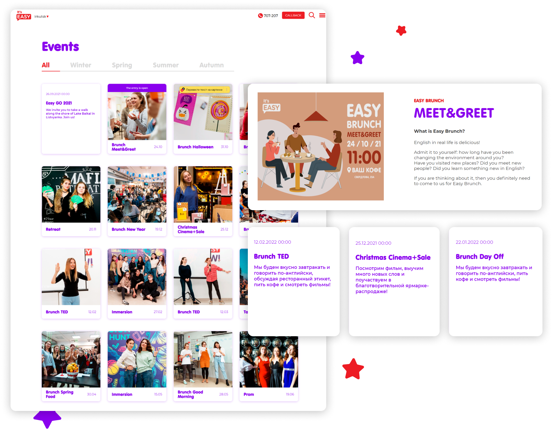
In that case we’ve decided to create a multi-stage filtering. Despite such complicated names it’s pretty easy to use.
A website user can always see an event calendar with marked dates. Meanwhile he can sort out events by months or filter the direction of interest.
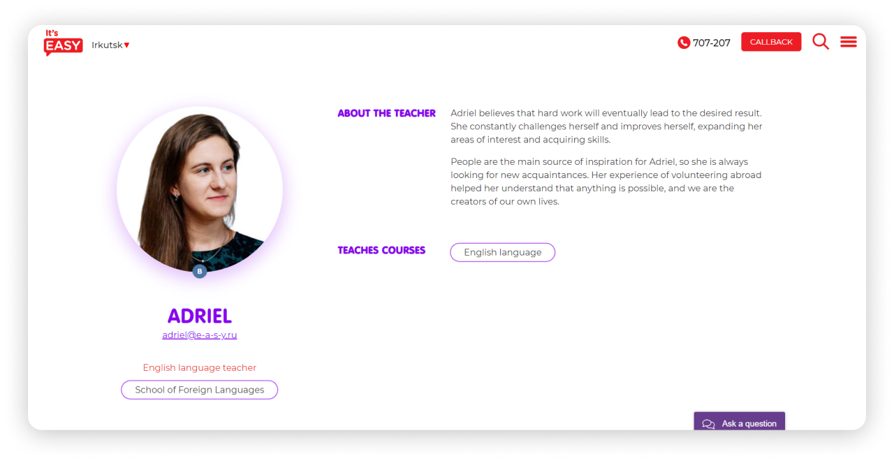
Teachers
There are a lot of fields of study in Easy School and even more teachers. In order for the list of teachers not to be boring or oversaturated with effects, we made a standard page with all the teachers and sorting function, but added a specific feature.
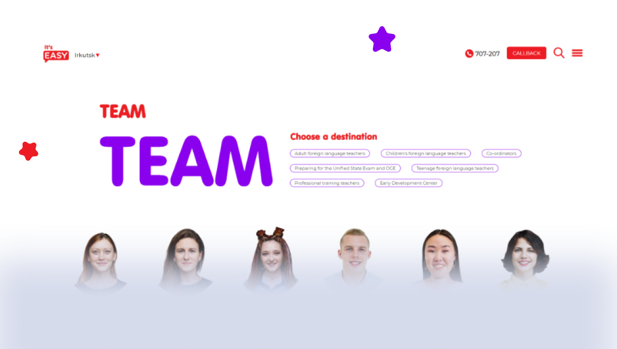
While analyzing the content website users usually move cursor following what they read. Our team decided to use this habit and added some interactivity – when a cursor finds the content part, a teacher’s card unfolds and somewhat follows your thought.
With the radical change of the Easy School website, customers behavior has also changed. We continue working on the website, analyzing website usage regularly and making plans to improve it.