Platinum Standard Education
Website design & development for the ”Platinum Standard Education”
Challenge
When the customer contacted us for the first time, he had nothing but the project name and agreements with universities. He needed to develop a visual package so that the brand would have an “image” both online and offline.
Target
- Create corporate identity: logo, guideline, merch
- Website template development
- Make a project presentation
Description
The project had to be done in a month. The customer consulted our agency at the end of October. The PSE sales season came at the end of the academic year and lasted all summer. It was necessary to start warming up the audience interest in the fall, because the dual degree program was a new format in education. That’s why it was important to design an identity, website, and product presentation as early as possible.

Work stages
- Development of several logo options and presentation to the customer
- Chosen logo enhancement and vector preparation
- Corporate colors and fonts finalization
- The Guideline development based on the materials prepared
- The dual degree program presentation development
- Website design & development based on the template
To meet the deadline, the work was done simultaneously. First we developed every aspect of identity and selected a website template. Then we started preparing the presentation, website and merch.
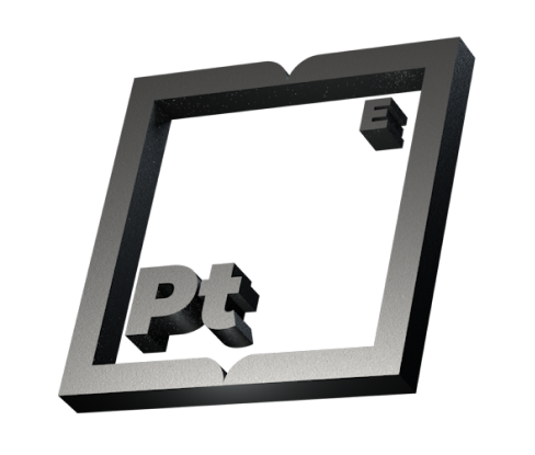
Logo design
The customer had several requests for the logo:
- Severity, presentability
- The logo had to have the “Platinum Standard Education” name on it
- The color scheme consisted of gray, white and black
We wanted the logo to be associated with the customer’s vision of education and project but at the same time unique. To make this happen, we involved two designers with different visions and styles. Each of them prepared their own associative series with the project and used them to make several logo versions.
Alexander, designer
Alexander used material associations:
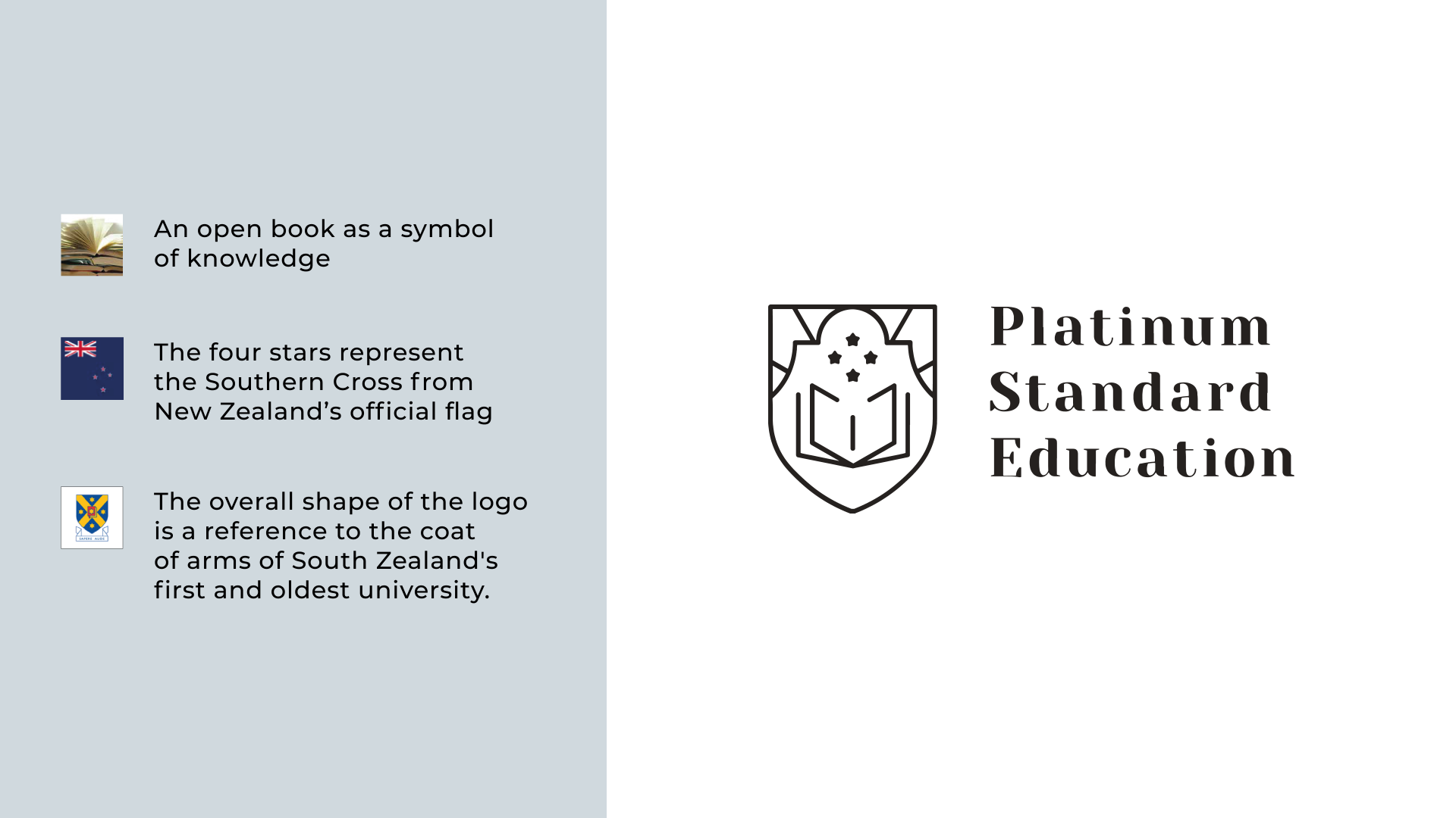
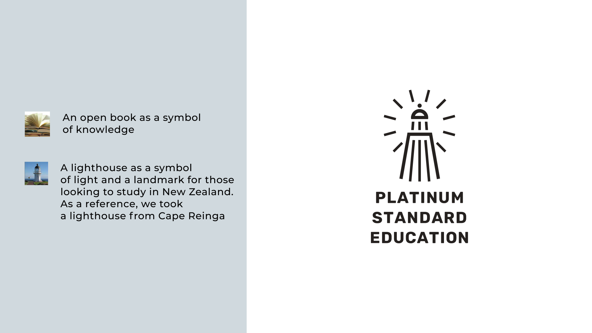
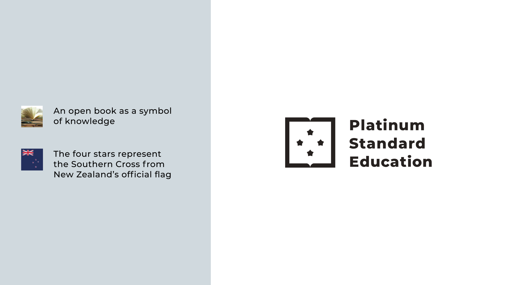
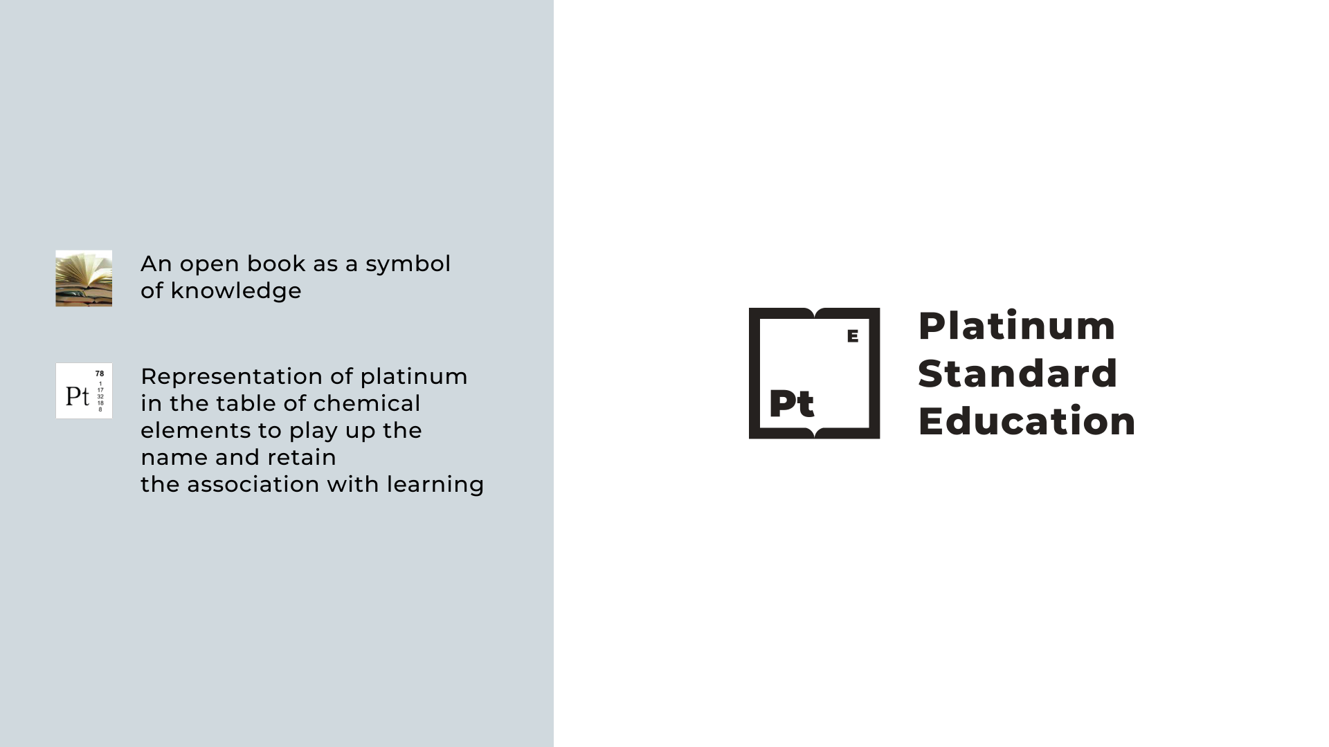
“Books and light are associations that are entrenched in people’s minds as symbols of education and knowledge. The word “education” is present in the name. The company name consists of three words, but the last word can be quickly forgotten because of the peculiarities of perception and memory. Therefore, mediocre associations were necessary.”
The company and its business line are closely connected with New Zealand. Even though there is no reference in the name.
Platinum is a metal that is more expensive than gold, with a neat gloss. It should be present in the logo to show “platinum standards” of education”

Daria, designer
Daria chose abstract associations:
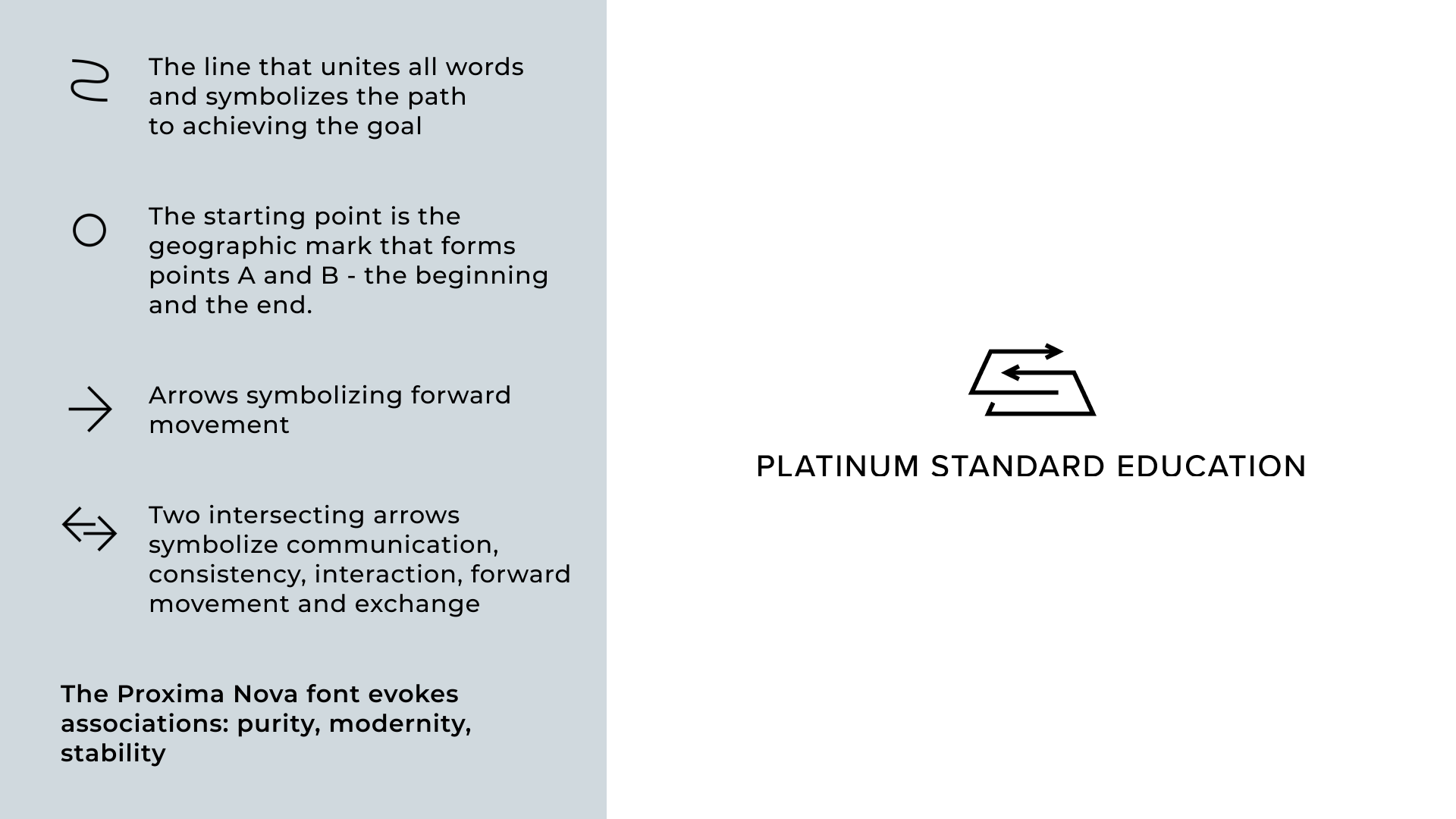


“Most people associated platinum with something valuable, expensive and solid, because it was a metal of value.
Since Platinum Standard Education combined New Zealand and Russia, I wanted to show the interaction of these two countries through images.
Degrees and universities went hand in hand in structure. And the main task of the company was to give the right direction to students, to help with development and growth in both career and personal aspects.”

Enhanced version of the logo chosen by the customer
Finding a color scheme
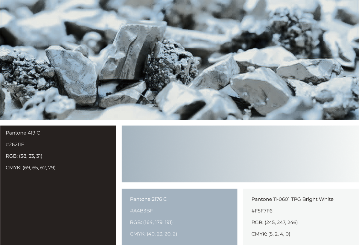
The colors were chosen with the customer’s requests. He really wanted everything to look neat and solid. We also wanted to show gloss on the logo to strengthen the platinum association. Therefore, the color palette was assembled on the basis of real metal photos.
Font selection
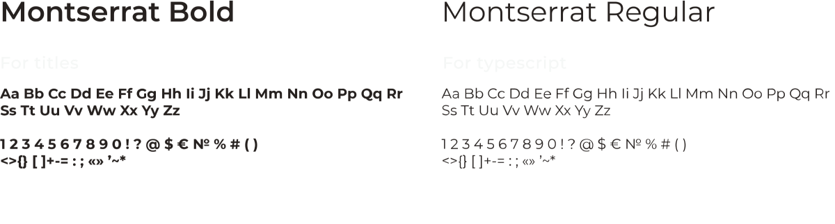
We have chosen Montserrat as the corporate font. It has straight and clean shapes that resonate with the logo. Montserrat is available in most editors, so the customer doesn’t need to ask a designer for help every time the layouts prepare for printing.
Guideline development
At Platinum Standard Education, different employees are responsible for different areas. Some do presentations, some do SMM, some prepare banners and launch search advertising, and some do events preparation.
To make sure that all the visuals were in the same style, we developed a guideline. It also came handy for the true.code team during the presentation preparation step.

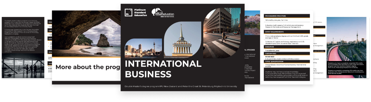
Making the presentation
The presentation is one of the main tools for informing students about the dual degree program. It contains all the necessary information: how the learning is conducted, what is included in the program, the terms of study and the cost.
The text and structure of the presentation was provided by the customer, and we have already included this data into the presentation. While making the presentation, we relied on the guideline, but we added a little yellow during the process, which was one of Kiwi Education’s primary colors.
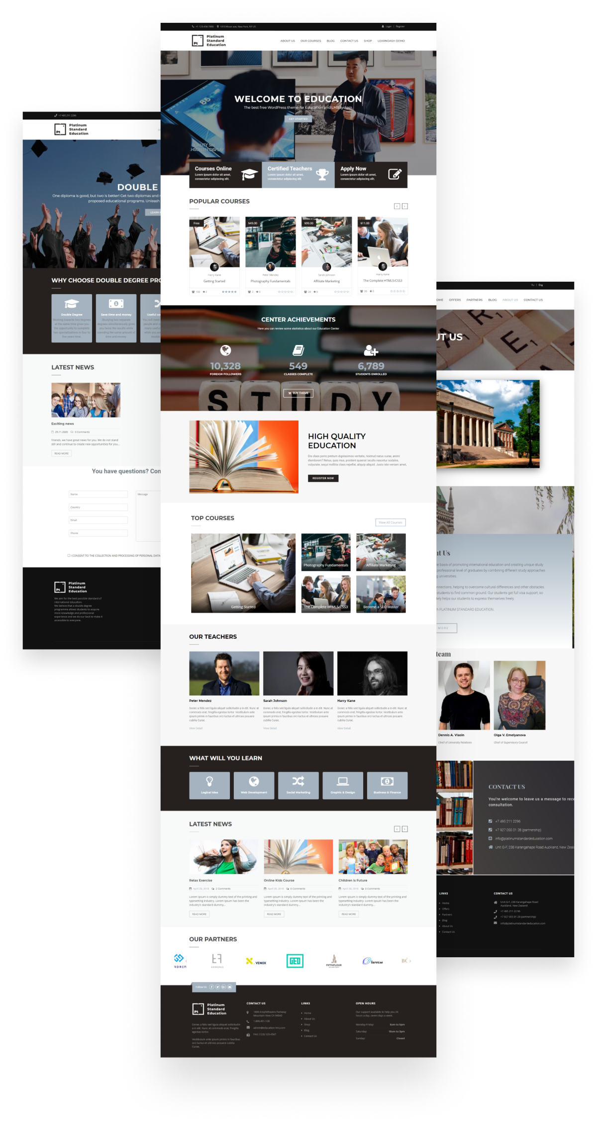
Website development
We decided to develop the website on a template because the customer had an obvious deadline. But the custom development would have taken 3-4 months instead of 2 weeks of template assembly.

Performed work
- We picked several templates with similar themes and chose one of them
- Prepared color scheme based on the guideline
- Made a multi-website out of a template with the option to switch the language
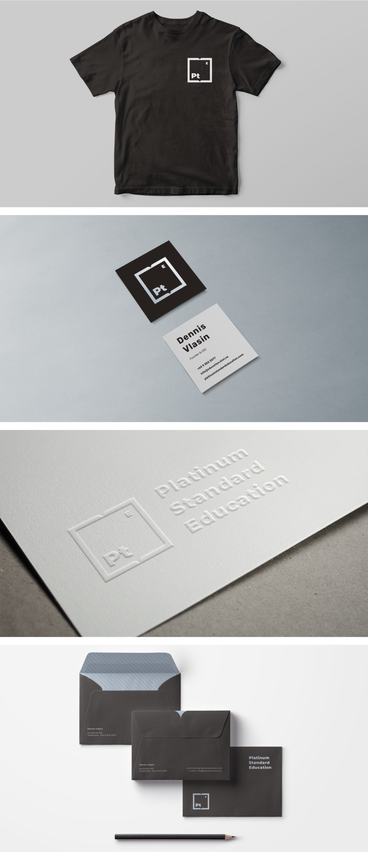
Making layouts for POS materials
The client needed a standard set of promotional products to use at offline events.
Results
We have made the project a week ahead of the deadline. Completely “packed up” the dual degree program in 3 weeks and got it ready to go:
- Platinum Standard Education has a new logo and corporate identity. Now it’s not just a program, but a full-scale brand
- The website lets students get familiar with the program and apply to study in Russia and New Zealand
- With the help of the presentation, students learn about dual study opportunities around the world
- The promo products, which can now be worn by students and distributed at various events by company employees, help the brand become better known and attract even more dual-education seekers
Reviews
It was easy and comfortable to work with true.code. When we had a need to launch our new direction website in a short time, they came through. We have been working with them for a long time on our other projects, so we know and trust the approach and are confident in the quality and speed of work.
The new project required not only a website, but also the complete development of an identity: from the logo to the documents forms. Within an hour we got in touch with Ruslan, the head of sales at true.code, who helped us make a blueprint for the website, gathered the requirements for the final result and a vision for the future company brand.
Three days later we were offered options for logos made by two different designers, allowing us to choose from a wider set of ideas and suggestions. We have discussed and agreed everything as the website layout was ready. Since then everything was like clockwork. Constant support from the true.code head of development Ekaterina in telegram, availability and willingness to help and suggestions. It was a pleasure to work. Also impressed by the turnaround time — everything was fast and on time. We are more than pleased with the result. Thank you

The main challenge was to make the dual degree programs brochure design for Kiwi Education. They know everything about moving, studying and working in New Zealand, Australia, Canada, the UK and Ireland.
Usually the purpose of presentations is to reveal one central topic, explaining it and outline related, but not so global issues.
In our case, we managed to fit 5 topics into one presentation, which actually should be covered separately in different presentations. At the same time, everything looks well-balanced and not overloaded.
The color scheme doesn’t strike the eye and does not force you to look closely. Minimalist style design, yet quite informative. The slides are included with moderately bright photos of nature, not too bright, while keeping a smooth transition to the next topic. This allows us to refresh the viewer’s attention, to relax and lead them to the desired thought.
The information arrangement and its number do not overload the slide, while the viewer can clearly track the sequence of information given out, and when viewing independently to see the key information.
In one presentation we talked about New Zealand; the company; the team; the NZ education system with educational institutions categories and housing costs; the Canadian, Australian, British, Scottish and Irish education systems; the Consortium; the dual degree program; and other KE projects.
The final slides to make a call or give a contact are very successful. Students took pictures of them from their seats. The information is placed conveniently, in optimal quantity and size. The targets and challenges were worked out perfectly, fit into just 29 pages.This presentation is extremely targeted and should not be made during other events. Nevertheless, the part, those slides that represent the company, the team, and the concluding slides, I suggest labeling as standard and make other presentations based on them. Separately for each topic, because it is very difficult to keep the audience’s attention, giving out so much information at once.
Thank you true.code for the contribution!